
Sketchbook · internal

Marks, wordmarks, motion, type & layout.

Six sections of options to react to. Pick favourites in each and we'll wire the chosen combination into the live site. Everything renders with the actual font and colour tokens - what you see is what'd ship.

00 · Brand reference

The brand we already own.

Found in Marketing/Brand/_Panda brand/: the original wordmark plus a licensed type kit. The modernisation comes through layout, motion and structure - the typographic foundations stay on-brand.

The original Panda wordmark - Panda set in Basis Grotesque Black with a single horizontal rule beneath.

Original wordmark.

The name set in Basis Grotesque Black (Colophon Foundry), sitting on a single hairline rule. No icon, no symbol - the wordmark itself is the mark. The rule beneath it is signature.

Architectural restraint.

Hairline rules around blocks and beneath wordmarks give the system an architectural feel - a visual analogue for Panda's commitment to precise, well-built solutions. We carry this through the new lab as a structural principle, not a decoration.

Display sans · candidates

The Basis problem.

Basis Grotesque Black is the original logo's typeface - but it's a paid Colophon Foundry font and there are no Basis files in your kit. Three paths:

  1. Licence Basis - most faithful, ~£200–300/year for a standard web licence at Colophon Foundry.
  2. Use a free near-twin - Hanken Grotesk Black or Inter Black both sit in the same humanist-grotesque neighbourhood.
  3. Use Telegraf - already licensed in your kit, slightly more squarish than Basis.

Same wordmark, four candidate typefaces, same size and weight. Compare:

  • Telegraf Ultrabold

    Pangram Pangram · already licensed

  • Inter Black

    Google Fonts · free

  • Hanken Grotesk Black

    Google Fonts · free · closest free analogue to Basis

  • Basis Grotesque BoldActive brand face
    Panda

    Colophon Foundry · licensed · live

Note: The "Basis Grotesque Black" tile renders in the currently active display font (Telegraf) - not actual Basis. It's there as a labelled placeholder for what would land in its place once licensed. The original PNG above this section is the only true Basis you'll see on this page.

Body serif · already in the kit

Source Serif 4.

Already in your brand kit as Source Serif Pro (Adobe, free on Google Fonts; Source Serif Pro and Source Serif 4 are the same lineage, the 4 is the variable upgrade). Sets prose and pull quotes throughout the new system. Warm humanist serif, comfortable for long-form.

Aa

Every reported concern about a child needs careful attention. But with heavy caseloads and squeezed resources, social workers need to prioritise and process referrals efficiently.

01 · Marks

Three-shape panda face.

Two eye-patches + one nose. No head outline. Positioned so the eye reads them as a face; up close they remain three pure geometric forms. Each shown at three sizes (160px / 56px / 28px), on paper and on ink.

  • Mark · three-roundels

    Three-roundels

    Two eyes + nose, all equal-radius circles. The Bauhaus panda - most geometric, most neutral.

  • Mark · three-pills

    Pill eyes + nose

    Horizontal pill eyes + round nose. Eyes feel like brand-mark strokes - most stylised.

  • Mark · three-almonds

    Almond eyes + nose

    Slanted almond eyes angling toward the nose. Hint of expression without going cartoon.

  • Mark · three-asymmetric

    Asymmetric eyes + nose

    Unequal eyes - lead + supporting. Carries the Pair energy into the three-shape language.

02 · Wordmarks

Bold + thin, capital P, panda alone.

Variations on the favourite - capital P, panda alone (no associates), and the lowercase original kept for comparison.

  • Wordmark · brand-reference

    Brand reference · Panda + rule

    Telegraf Ultrabold + horizontal rule. The closest to the existing brand.

    Panda
    Panda
  • Wordmark · brand-with-associates

    Brand + associates

    Brand reference with the 'associates' line set as thin sans. The full firm name.

    Pandaassociates
    Pandaassociates
  • Wordmark · panda-cap-alone

    Panda · cap, alone

    Just the name in Telegraf, capital P. No associates, no rule. Most distilled.

    Panda
    Panda
  • Wordmark · bold-thin-cap

    Panda associates · cap

    Telegraf Panda + thin lowercase associates. No rule.

    Panda associates
    Panda associates
  • Wordmark · panda-lower-alone

    panda · lower, alone

    Lowercase panda in Telegraf. Most contemporary.

    panda
    panda
  • Wordmark · bold-thin

    Bold + thin (Inter, v1)

    Pre-Telegraf reference - Inter, lowercase. Kept so you can A/B against the brand face.

    panda associates
    panda associates
03 · Lockups

Mark + wordmark, paired.

Every mark paired with every wordmark, at the size they'd run at in the header.

Mark ↓ · Wordmark →Brand reference · Panda + ruleBrand + associatesPanda · cap, alonePanda associates · cappanda · lower, aloneBold + thin (Inter, v1)
Three-roundelsPandaPandaassociatesPandaPanda associatespandapanda associates
Pill eyes + nosePandaPandaassociatesPandaPanda associatespandapanda associates
Almond eyes + nosePandaPandaassociatesPandaPanda associatespandapanda associates
Asymmetric eyes + nosePandaPandaassociatesPandaPanda associatespandapanda associates
04 · Hero motion

One insight, transforming.

Five states: a tiny insight grows, satellites organise around it, the prototype refines, ships, and ripples out as user delight. Two visual treatments of the same story, plus the v1 sequential build for comparison.

  • Motion · sequential

    Sequential build (v1)

    Four circles fade in left-to-right and grow. Stepwise progress - the original. Kept for comparison.

  • Motion · lifecycle

    Lifecycle

    One insight travels left-to-right, transforming at each station: spark → prototype → built → shipping → delight rippling out.

  • Motion · centred

    Centred

    Same five-state story, but in place. A core grows, satellites organise around it then fold in, ripples emanate. Compressed for layouts beside a headline.

Reload the page to watch the entry animations fresh. All animations honour prefers-reduced-motion.

05 · Type pairings

Sans display + serif body, two ways.

Both pairings introduce Source Serif 4 for prose - the closest free analogue to Anthropic's Claude Serif. They differ in what carries the display.

  • Pairing · alpha

    α - Telegraf + Source Serif 4 (brand-faithful)

    The brand's owned typefaces. Telegraf Ultrabold for declarations, Source Serif 4 for the conversation.

    Our approach

    Making tech work for people.

    Thirteen years of user-centred design, now multiplied by AI tooling that turns insights into working prototypes in days, not months.


    Every reported concern about a child needs careful attention. But with heavy caseloads and squeezed resources, social workers need to prioritise and process referrals efficiently. Together we designed a system that reduced inappropriate referrals to statutory social care by two thirds - freeing social workers to focus on the cases that needed them most.

    “Care was taken throughout the project to ensure that our in-house Service Designers benefited from invaluable knowledge and skills transfer.” - Jonathan Cordier, Head of Service Design
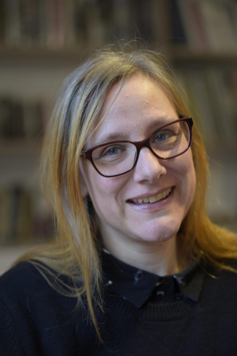
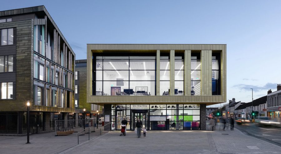
  • Pairing · beta

    β - Display serif + serif body

    Fraunces (display) + Source Serif 4 (body). All-editorial. More distinctive, less ‘tech’.

    Our approach

    Making tech work for people.

    Thirteen years of user-centred design, now multiplied by AI tooling that turns insights into working prototypes in days, not months.


    Every reported concern about a child needs careful attention. But with heavy caseloads and squeezed resources, social workers need to prioritise and process referrals efficiently. Together we designed a system that reduced inappropriate referrals to statutory social care by two thirds - freeing social workers to focus on the cases that needed them most.

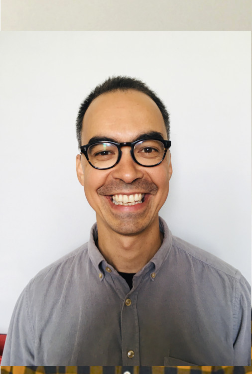
    “Care was taken throughout the project to ensure that our in-house Service Designers benefited from invaluable knowledge and skills transfer.” - Jonathan Cordier, Head of Service Design
06 · Layout treatments

Dark blocks cutting into canvas.

Two structural moves where solid black overlaps or extends beyond the natural section boundary. References: Collins, Work & Co.

  • Treatment · dark-band

    Dark-band hero

    The headline crosses a paper-to-ink boundary. The most signature, most aggressive - works as the home hero.

    Panda Associates · est. 2013

    Making tech work for people.

    Making tech work for people.

    A user-centred product studio. Research first, prototype fast, ship what works.

  • Treatment · stamp

    Stamp panel

    A solid black panel sits half-off the right edge, holding a section number and label. Structural anchor for section openers.

    01Our
    work
    Section · 01

    Useful things, made with the people who use them.

    A handful of projects we've helped clients ship - across public sector, sustainability, charity and consumer markets.

07 · Header lockup

Asymmetric mark, to the left of the wordmark.

The three-shape asymmetric mark - two unequal eye-patches and a nose - paired with the production wordmark at header scale. Three configurations: bare lockup, mark beside the black tile, and a unified chip with both inside one tile. Kept on record after the production header reverted to wordmark-only.

  • Lockup · bare

    A · Mark + bare wordmark

    Conventional icon + logotype. Mark and wordmark both inherit currentColor; no tile, no border. Mark sized to 22 - matching the wordmark's SVG box, with the visible glyphs sitting within the cap-height of the P.

  • Lockup · tiled

    B · Mark + tiled wordmark

    Mark sits on the surface; the wordmark keeps the black tile. Hybrid - keeps the chip, adds the mark beside it.

  • Lockup · unified

    C · Unified chip

    Both mark and wordmark inside a single black tile. Reads as one brand object - strongest header presence, most compact.

Pick one and we'll wire it into components/site/Header.tsx. All three honour the existing tile + viewBox we just landed on the wordmark, so the swap is a small one.

08 · Material studies

What the editorial system feels like in the hand.

Three tactile grounds - powder-coated aluminium, wool felt, warm paper card - each carrying a different register of content. Material does the warming; typography stays disciplined and on-kit. Discipline borrowed from Dieter Rams: less but better, hairline geometry, the existing black-and-white rule held.

Material · 01

Built to outlast the brief.

Honest materials, considered geometry, function before decoration. The practice makes work that earns its keep - work that gets used long after the launch noise quietens.

Powder-coated aluminium04 / 05 / 26
Practice note · 03
“We don’t decorate the brief. We rebuild it.”
Internal memo · 2025
Project · 04

Trefoil for Hertfordshire.

Triage tool for child referrals. Built with social workers, tested with their caseloads.

Read →18 min
09 · Dot grid motion

From insight to ship - fast.

The studio's pitch is speed: research insights translated into working software in days, not quarters. Three readings of that - comic-illustration speed trails (sprinter / racing-car shorthand for motion), a 5×7 pixel font scrolling like a 1965 line printer, and a third, smoother reading: a thin-line iteration loop that resolves into a dotted face - the studio's pitch enacted, not just described. The first two are binary halftone driven by (x, y, t) → 0 | 1; the third is pure CSS keyframes on transforms - smooth, no jitter. All honour prefers-reduced-motion.

  • Motion · speed-trails

    Speed trails

    Three streaks zooming across the grid at different speeds. The leading edge is solid; the tail thins via dot density (50%, then 33%) — the comic-illustration shorthand for motion.

  • Motion · matrix

    Dot-matrix ticker

    A 5×7 pixel font scrolling right-to-left through the grid, like a 1965 line printer. Spells INSIGHT ▸ SHIP on loop — the studio's pitch in the language of the medium.

  • Motion · iteration-loop

    Iteration → delight

    A thin-line loop spins clockwise through two turns while expanding from 25% to full size, then resolves into a dotted smile. Pure CSS transforms - smooth, no jitter. The studio's pitch enacted in 4 seconds.

Pick one and we'll find it a home - a hero strip, a section divider, or a hover state on a case-study card. The renderer is grid-size and dot-size agnostic, so the same pattern can run as a 36×14 banner or a 24×24 square.

10 · Halftone treatment

Photos in the brand's halftone discipline.

Tone-driven halftone - each grid cell samples the source photo's luminance and draws a dot whose radius scales with darkness. Two sample images from the live site (a portrait + a project hero) shown at three intensities plus a hover-reveal mode (halftone at rest, photo on hover or focus). Lichtenstein, mid-century mass-print, and the K.O.II halftone block all live in the same place.

Pure client-side canvas, devicePixelRatio-aware, no build step. Same B/W discipline as the rest of the system.

Source · Portrait

Same image, four treatments - original, then halftone at three cell sizes. The rightmost panel reveals the photo on hover.

  • Portrait - sample halftone treatment.
    Original
  • Subtle · cell 4
  • Moderate · cell 6
  • Portrait - sample halftone treatment. - strong halftone, photo on hover
    Strong · cell 9 · hover
Source · Project hero

Same image, four treatments - original, then halftone at three cell sizes. The rightmost panel reveals the photo on hover.

  • Project hero - sample halftone treatment.
    Original
  • Subtle · cell 4
  • Moderate · cell 6
  • Project hero - sample halftone treatment. - strong halftone, photo on hover
    Strong · cell 9 · hover
Inverted · on ink

Same engine, inverted: paper dots on ink ground. The luminance reading is flipped so light areas of the photo become dense paper dots - useful for hero panels on a black surface.

  • Portrait · inverted · cell 6
  • Project · inverted · cell 6
Colour halftone

Same engine, dots filled with the source pixel's actual RGB. Departs from the no-accent-colour rule - opt-in for surfaces where colour earns its keep. Risograph, Lichtenstein, mid-century comic.

  • Portrait · cell 6
  • Portrait · cell 9
  • Project · cell 6
  • Project · cell 9

The default is mono - paper-on-ink for portraits, ink-on-paper for project images - and is being applied site-wide (the founder section on /about, ImageBlock in MDX, case study heroes). Colour is opt-in via the colour prop where it earns its keep.

11 · Image treatments

Photos, treated like museum objects.

Three quieter image treatments drawn from mid-century print: a duotone (photo flattened to a single ink ramp on the page ground), an architectural framing (hairline rules + plate-numbered caption), and a triptych (three panels at strict ratio). Each retains the photo's content - the treatment is restraint, not pattern.

Treatment · duotone

Two-tone ramp.

Per-pixel luminance lerped between a shadow and a highlight colour. Brand-coherent, retains every detail of the photo. New Yorker / FT Weekend / Vitsoe catalogue.

  • Portrait - original (visible orange + skin tones).
    Original
  • Ink → paper
  • Ink → bone (warm)
  • On ink ground
  • Project hero - original.
    Original
  • Ink → paper
  • Ink → bone (warm)
  • On ink ground
Treatment · framing

Hairlines and plate numbers.

Photo untouched. Hairline rules above and below, side matting, mono-caps caption with plate number and metadata. The framing is the design move. Pairs cleanly with duotone or left as colour.

Plate 04Founder · Panda Associates
2024
A · Light hairlines, flush
Plate 12Trefoil for Hertfordshire CC
Service / 2024
B · Single rule beneath
Plate 07Practice
Portrait / 2024
C · No rules - caption only
Plate 18Hertfordshire CC
Hero / 2024
D · Corner crop marks
Treatment · triptych

Three panels, strict ratio.

Three crops or three related images at a fixed ratio, with hairline rules top and bottom - a "spread" rather than a "card". Eames Case Study House plan-views; Aalto's three-image studies. Best for case study heroes.

  • 01 · Hero
  • 02 · Process
  • 03 · Outcome
  • Portrait crop A
    01
  • Project crop
    02
  • Portrait crop B
    03

Tell me which (and which combination) sits best - duotone is the most universal default; framing scales to any image without processing; triptych is a specific case-study composition. They stack: a triptych of duotone images inside a frame is a single fully mid-century treatment.

12 · Generative motion

Two heavier, canvas-based candidates.

Unlike the CSS hero motions above, these run on <canvas> / WebGL - more presence, more weight. Both are monochrome to stay on-brand and both honour prefers-reduced-motion (static frame, no loop). Shown on ink, where they belong.

  • WebGL · anomalous matter

    Anomalous matter.

    A wireframe icosahedron displaced by 3D simplex noise, lit by a point light that follows the cursor. A full-bleed hero treatment - heavier than anything else here.

    Open full-screen ↗
  • Canvas · entropy

    Entropy.

    An ordered particle grid on the left dissolving into chaos on the right, chaos bleeding across the divide. A self-contained square - works as a motif beside a headline.

    Open full-screen ↗

Reload to watch each start fresh. Note these ship a heavier runtime than the CSS motions - three for the icosahedron, a per-frame canvas loop for entropy.

13 · Fit motion

Solutions shaped to the problem.

A jagged surface rises. Blocks drop in, turn to find their orientation, and land keyed into the gaps - each underside cut to the steps beneath it. When the last block locks in, the seams snap shut into one surface and it shines, then sinks to become the ground the next problem grows from. Rounded, weighted, a little playful: squash on landing, a thud through the stack.

  • Finish · sparkle

    Sparkle.

    Four-point glints twinkle left to right - some from the corners where blocks met, some straddling the top edge, inverting white to black as they cross it.

  • Finish · glint

    Glint.

    A thick and a thin hard-edged bar sweep across - the flat-graphic mark for a glossy surface.

  • Finish · halftone

    Halftone.

    A band of halftone dots swells and shrinks as it sweeps across, like light caught in print.

  • Finish · road

    Road.

    The finished strip becomes a road: centre markings paint on and pandas ride across on scooters and bikes - the level surface makes other good things possible.

  • Finish · wave

    Wave.

    A liquid swell rolls along the top edge, with a shallower trough ahead, smaller swells behind and chop across the surface, and a panda surfing its face.

  • Finish · parade

    Parade.

    Builds once to solid black, then slowly and endlessly, one at a time: a panda surfing, a panda on an e-scooter, a panda driving an electric microbus.

  • Canvas · fit · mono

    Mono.

    Blocks arrive as outlines and flood solid as they land, merging into one foundation with hairline seams.

  • Canvas · fit · tonal

    Tonal.

    Each block keeps its own grey - the finished surface reads as a patchwork of distinct pieces of work.

Open as a hero ↗
14 · Swamp motion

Something beautiful rising out of the slop.

Hero motion for the new homepage. A black swamp heaves along the foot of the hero, flush with the black section below, and one crafted thing rises out of it and stays: a drop that pinches free, a lotus, or a sphere that sheds its coat. Add ?at=4 to the URL to freeze every sketch at 4 seconds.

Open as a hero ↗
15 · Craft motion

The machine's speed, a maker's hand.

Hero motion, round two. The swamp's lotus redrawn to a finish, beside two new ideas where speed and abundance are the raw material rather than the enemy, and craft is what shapes them: a pot thrown on a fast wheel, and a shrub that grows wild and is clipped to a perfect ball. Add ?at=6 to the URL to freeze every sketch at 6 seconds.

Open as a hero ↗
16 · Horizon motion

The possibilities are endless

Hero motion, round three, on a black hero: a horizon that keeps opening up, and the focus it takes to find your way through it. Zoom out, flight and the cups game, then forking paths and a lens pulling focus.

Open as a hero ↗
17 · Homepage drafts

The homepage, and its alternatives.

Complete pages running on the site's real content: the live homepage, and the alternatives kept alongside it for review.

  • Now the homepage

    Out of the slop.

    A lotus rises out of the swamp under the headline, then What we do on black, the work and the latest journal posts.

    Open the page ↗
  • For sharing · 1 of 3

    Home 1: Fit and finish.

    The Fit and finish hero - blocks build and a spirit level topples in - over today's homepage sections.

    Open the page ↗
  • For sharing · 2 of 3

    Home 2: Out of the slop.

    The swamp hero, a lotus rising out of the slop (the mud variant), over today's homepage sections.

    Open the page ↗
  • For sharing · 3 of 3

    Home 3: The possibilities are endless

    The slower flight on a black hero (B2 in /sketchbook/horizon), with What we do turned white beneath it. The live homepage since 8 October 2026.

    Open the page ↗
  • Alternative · Out of the slop

    When building is easy, design is what counts

    The homepage before the flight: the lotus (bloom) rising out of the slop, then the services loop and the needs drum on black, the work and the latest journal posts.

    Open the page ↗
  • Alternative · Fit and finish

    Fit and finish.

    The homepage before the swamp: blocks build and a spirit level topples in under the headline, then services on black, the work, a testimonial and the latest journal posts.

    Open the page ↗
  • Draft · halftone

    We are Panda.

    Stripped back to the copy: each line drifts in and out, one at a time, over a halftone field that fills the page.

    Open the page ↗